CoolEvents · Visual identity · Creative direction · Campaign design
Bubble Run
A playful identity with a light, welcoming tone.
Explore the work ↓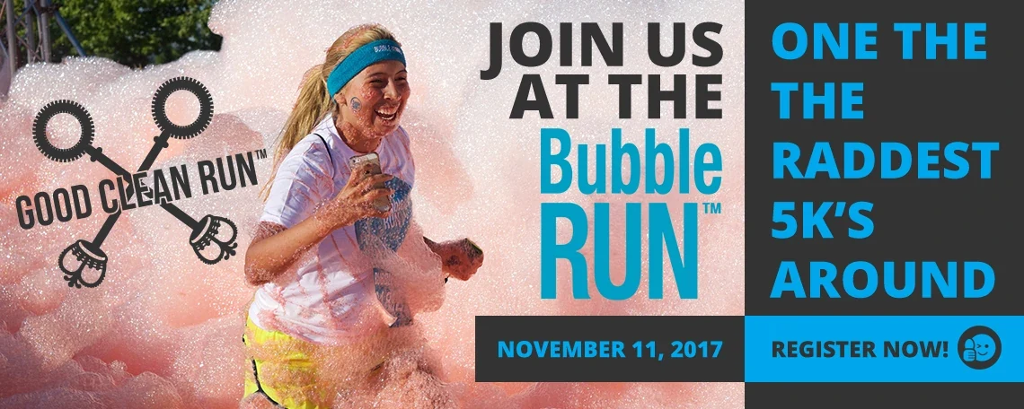
The project
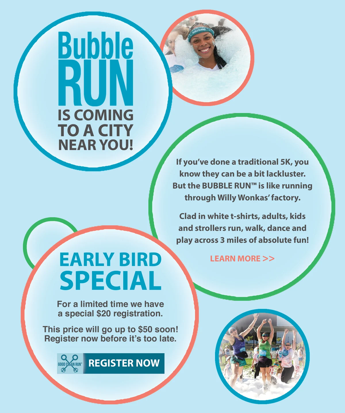
As Director of Brand Development at CoolEvents, I led the visual direction of Bubble Run, from concept development through design execution. Colorful event communications extend the brand’s playful, approachable character.
- My role
- Director of Brand Development, CoolEvents; visual direction, concept development, and design execution
- Scope of work
- Visual concepts and creative direction
- Promotional email design and implementation
- Outdoor billboard design
- Social-media campaign layouts
The context
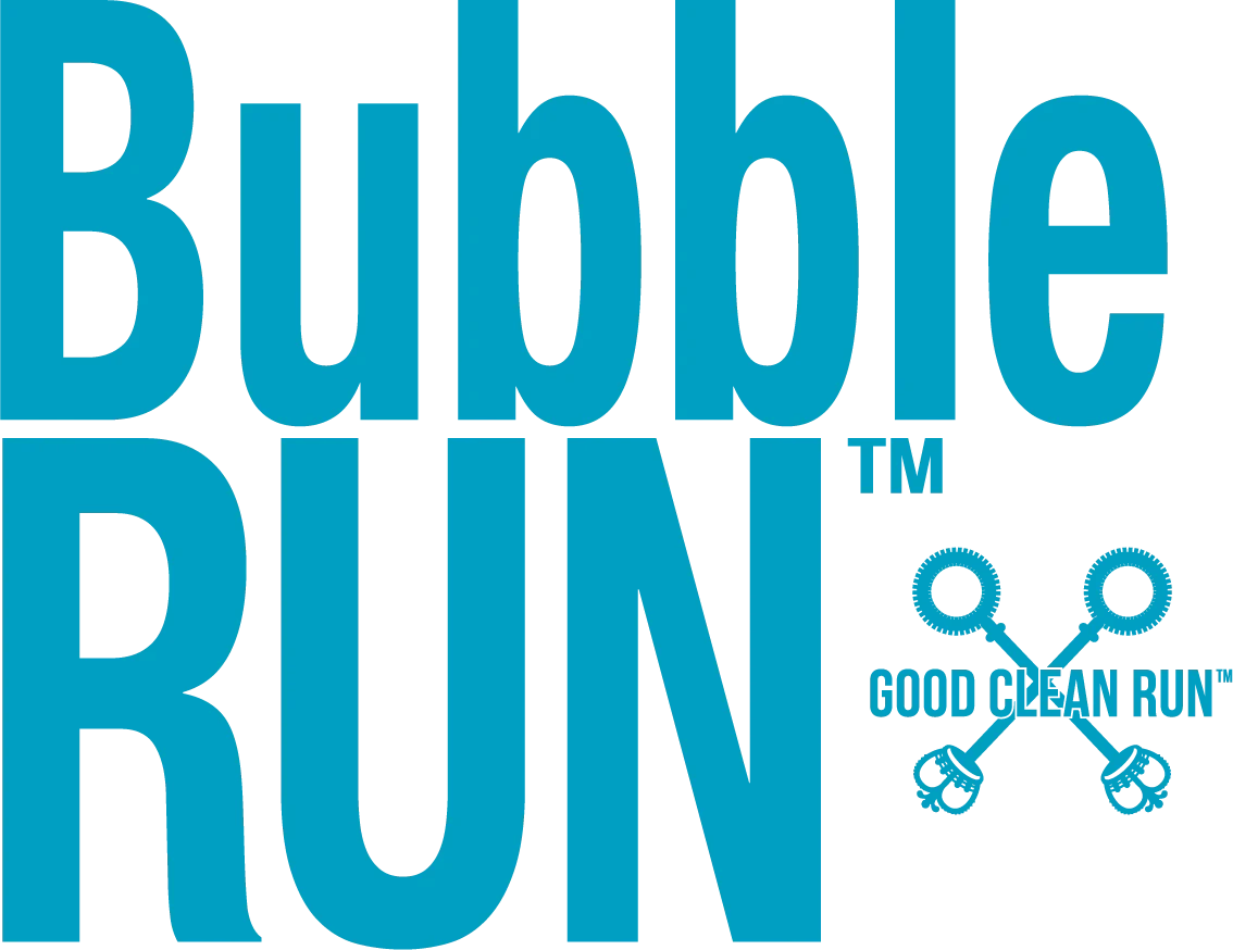
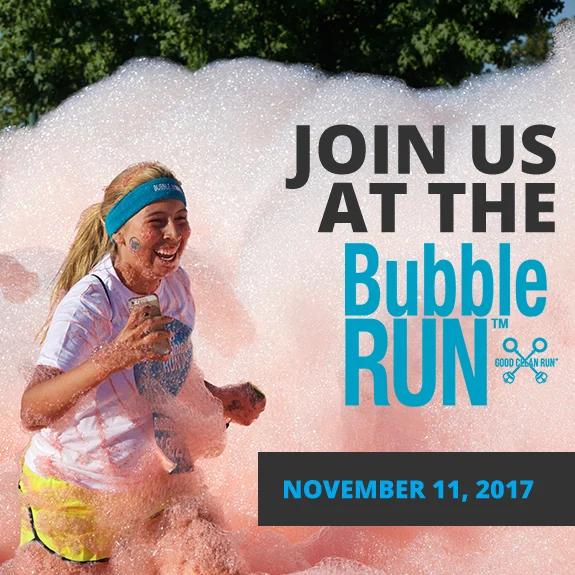
Bubble Run’s bright, welcoming identity appears across digital campaigns and outdoor advertising. Original production exports add a fuller view of the logo system and the difference between a close-reading screen layout and a quick-reading billboard.
Design approach
Aqua typography, generous white space and rounded symbols give the work an approachable tone. The wide digital banner balances participants, brand and registration; the Pomona billboard reduces the message to the event name, date and address. A seasonal campaign carries the same colors into a new visual setting.
01 / Project details
Identity in use
02 / Project details
From promotion to the event
03 / Project details
Campaigns & communication

Project record
Selected work from my design archive. Campaign dates, offers, and contact details pictured in the original materials are historical. Photography and client identities remain credited to their respective creators; my contribution is described above.