Education · Advertising · Brand application
ATP Flight School
A training brand, from first impression to arrival.
Explore the work ↓
The project
Advertising, event collateral and physical signage that keep ATP’s established identity consistent across the path from prospective pilot to training-center visitor.
- My role
- Graphic design and project management; collateral production and signage coordination. Existing ATP identity, third-party aircraft photographs and sign fabrication are not claimed.
- Scope of work
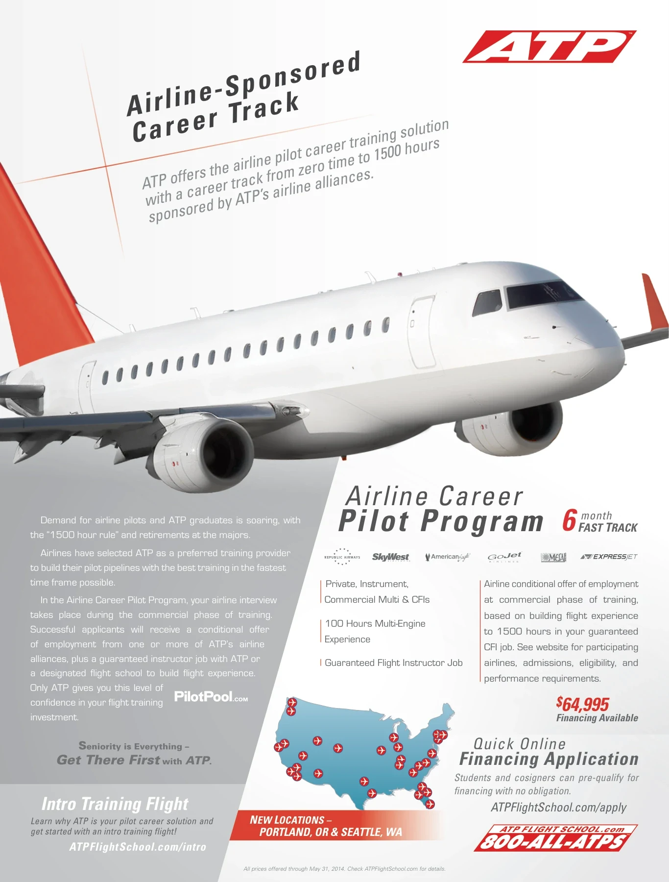
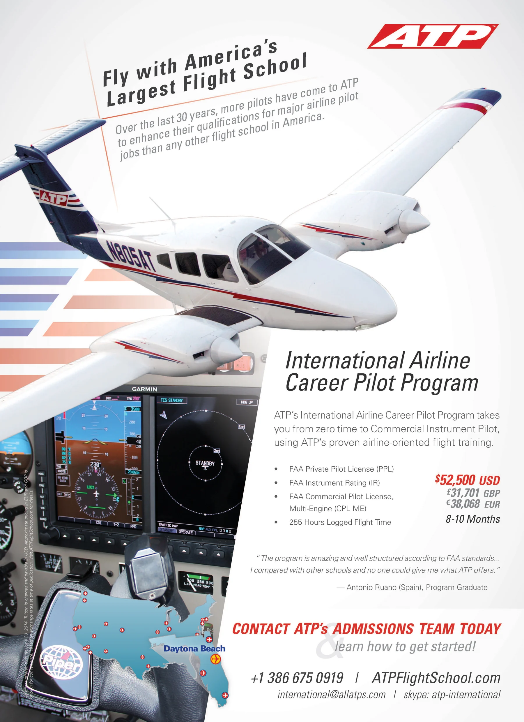
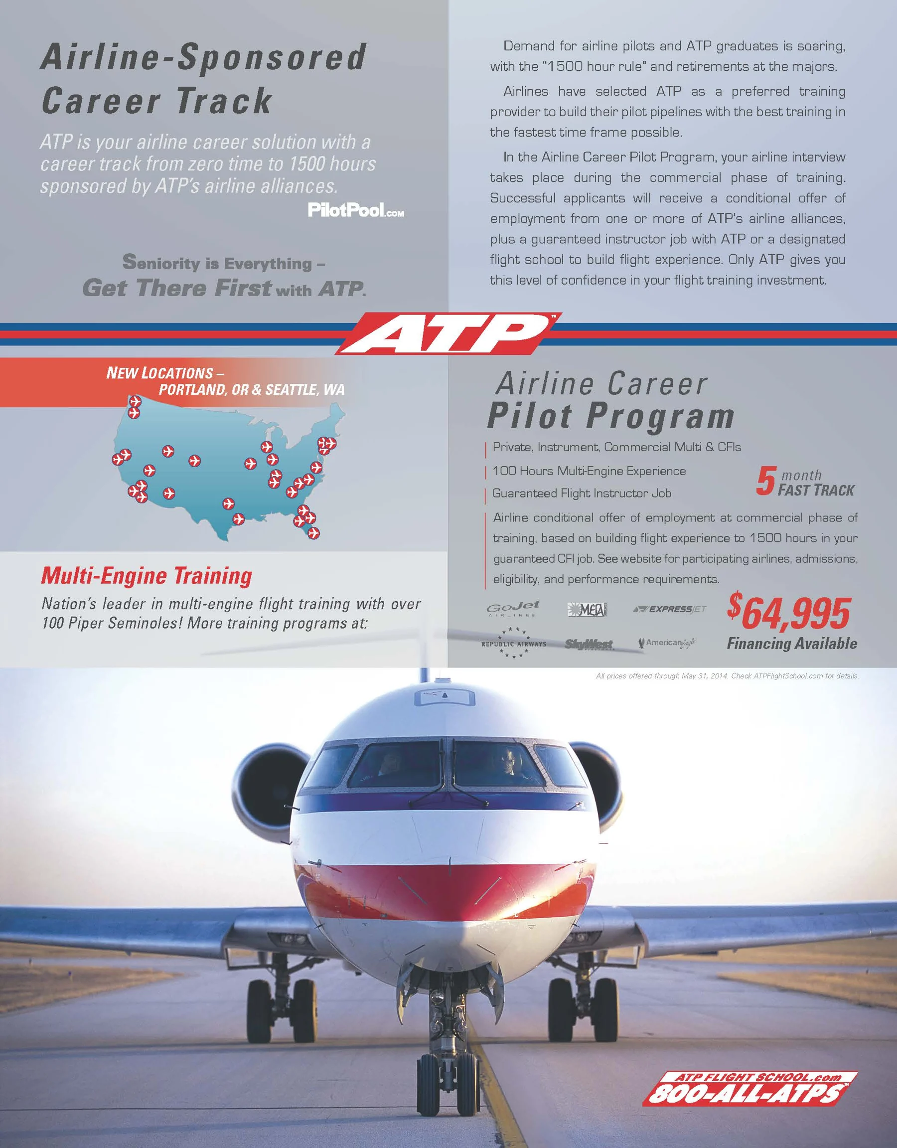
- Magazine advertisements
- Digital banner advertisements
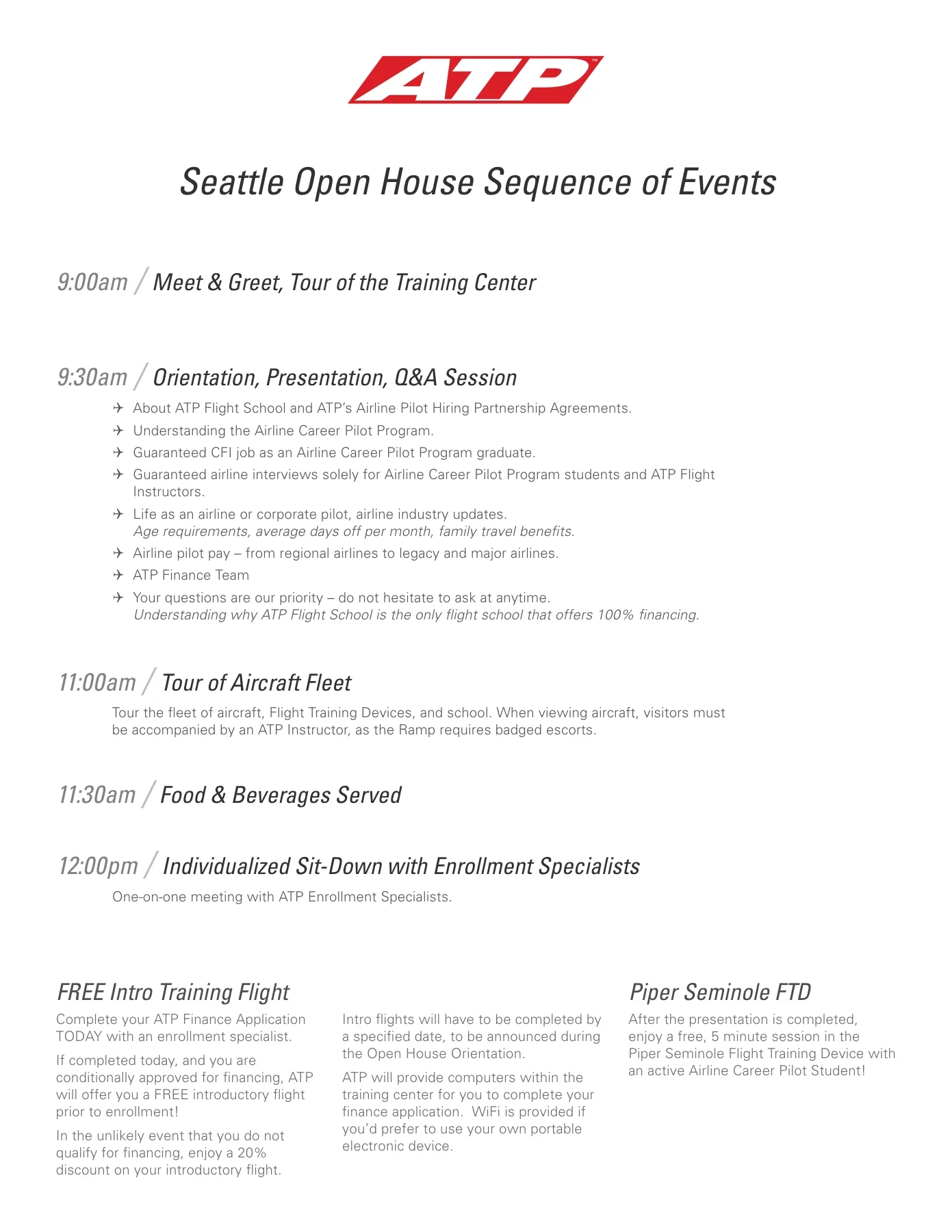
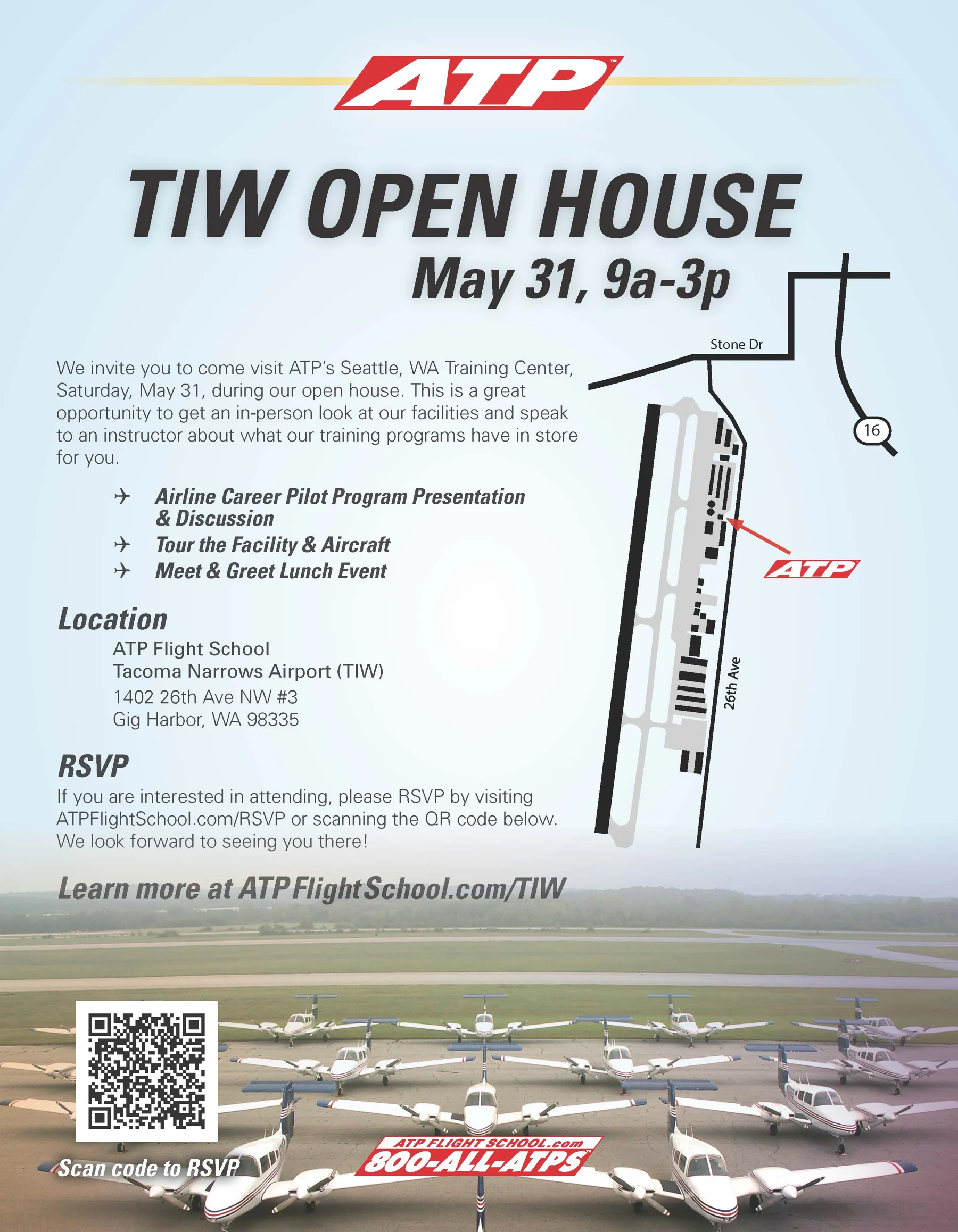
- Open-house flyer
- Training-center map
- Business cards
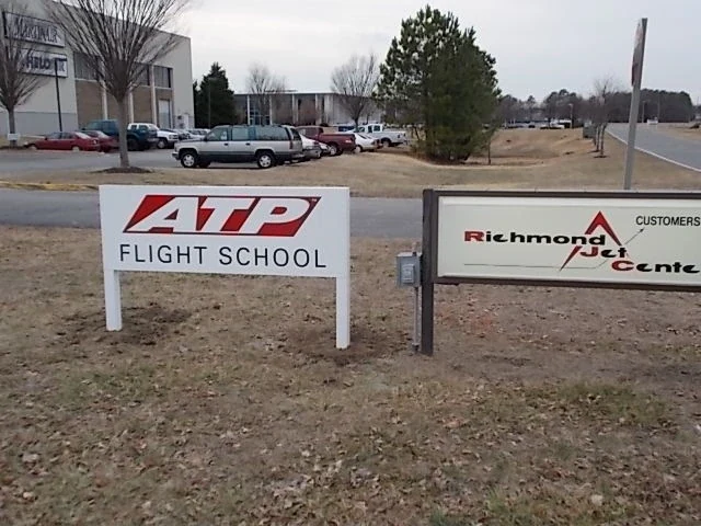
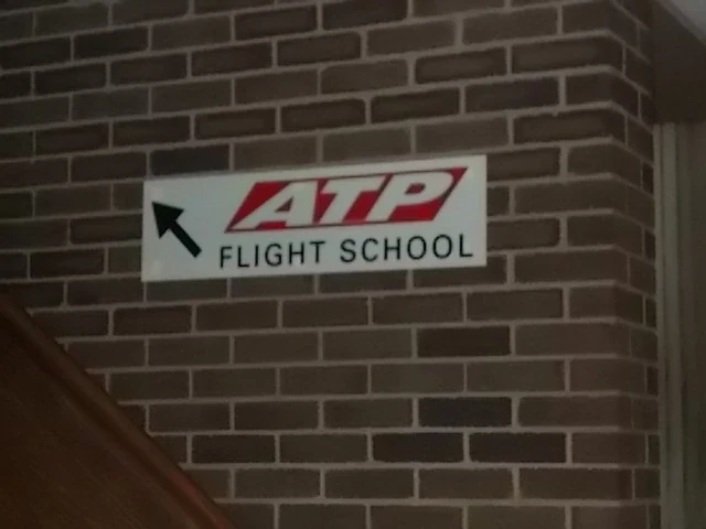
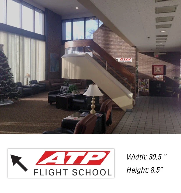
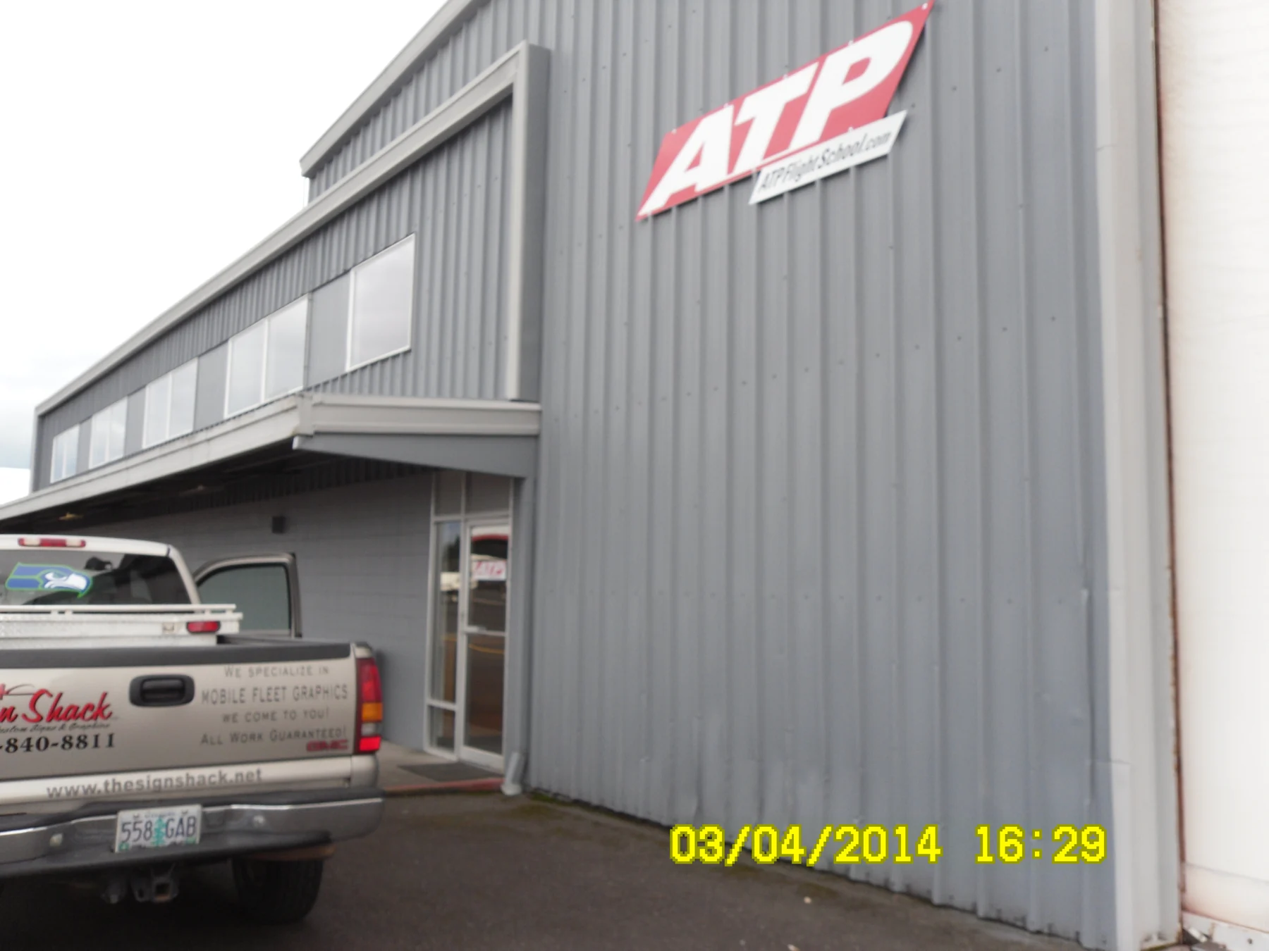
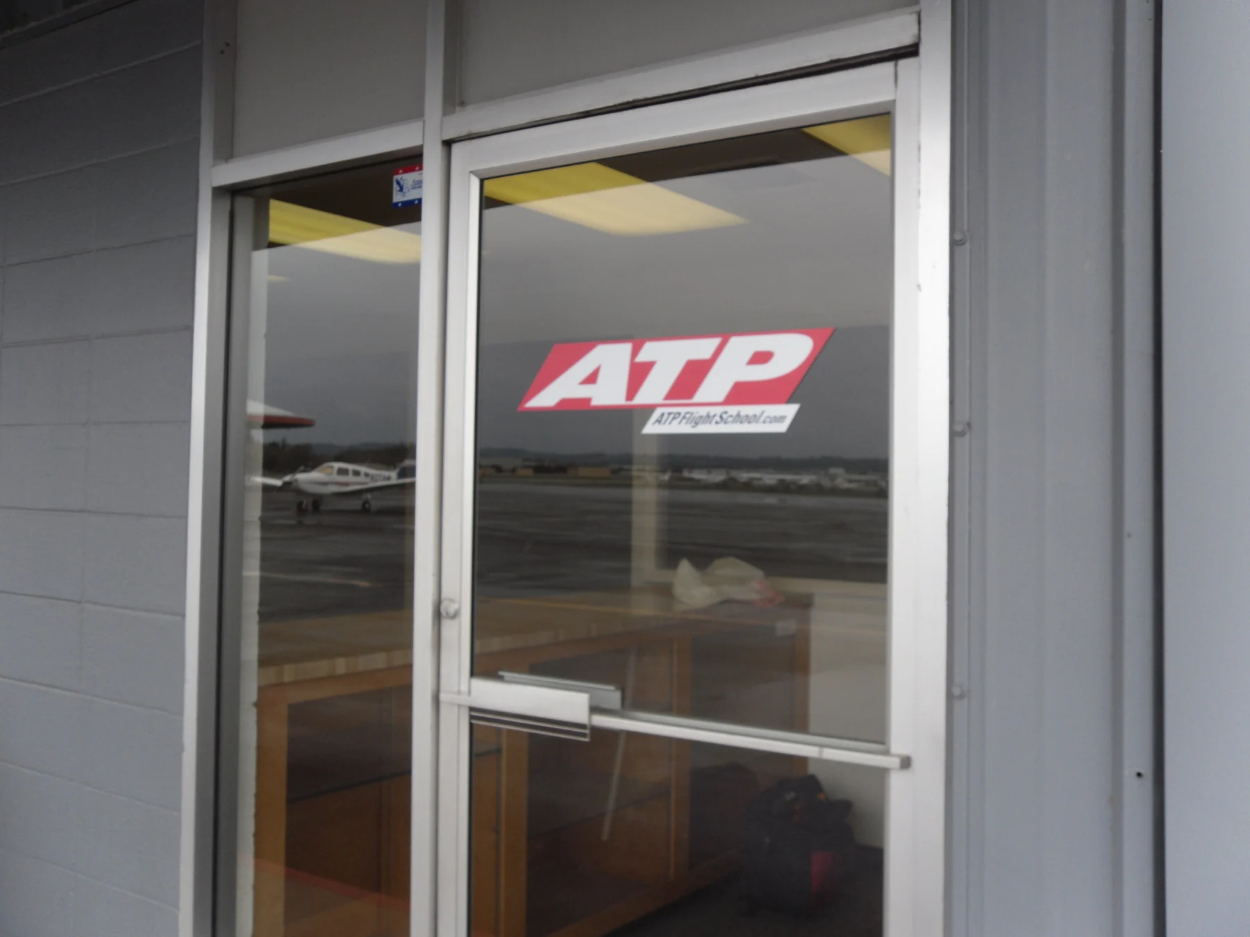
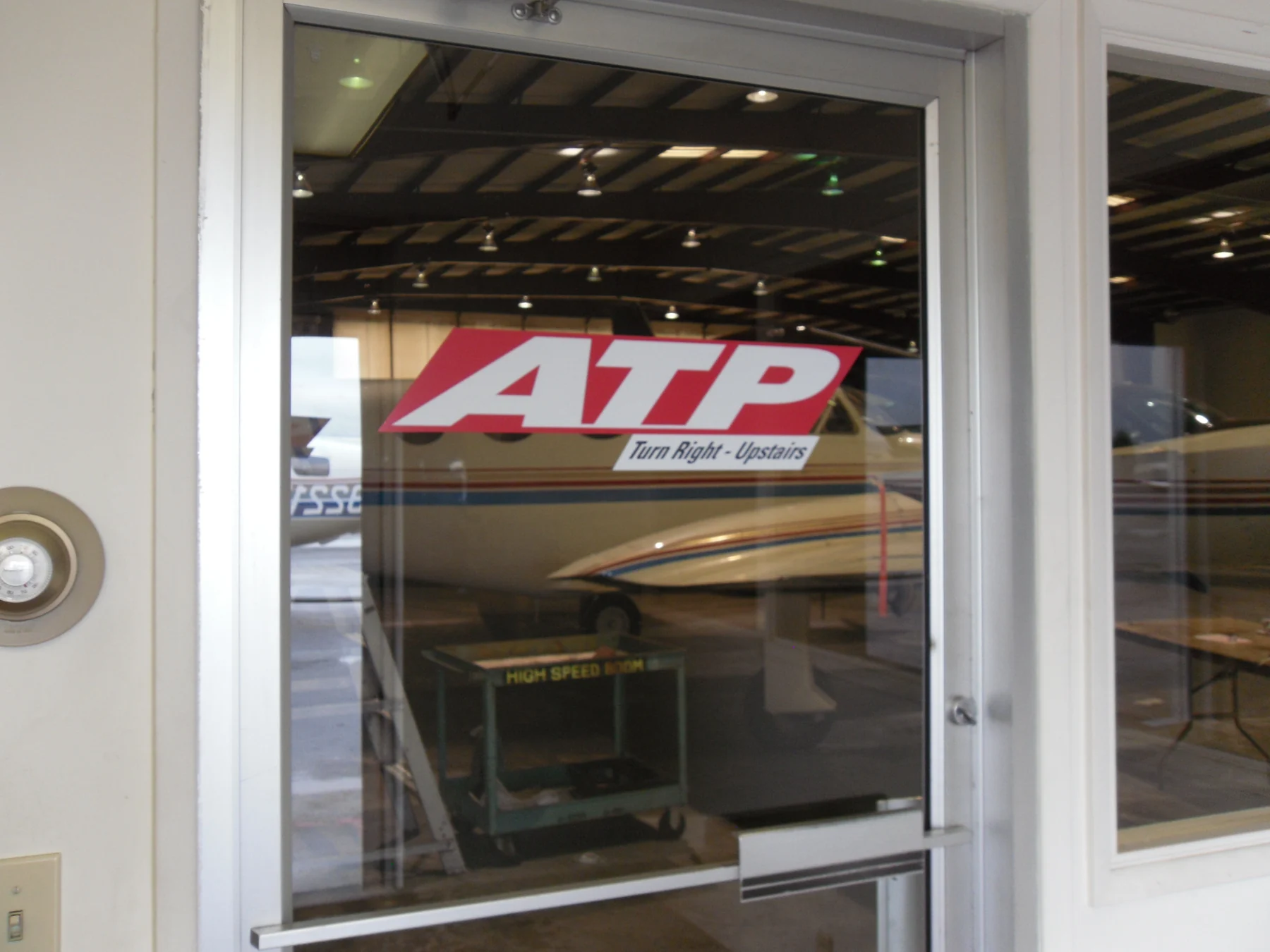
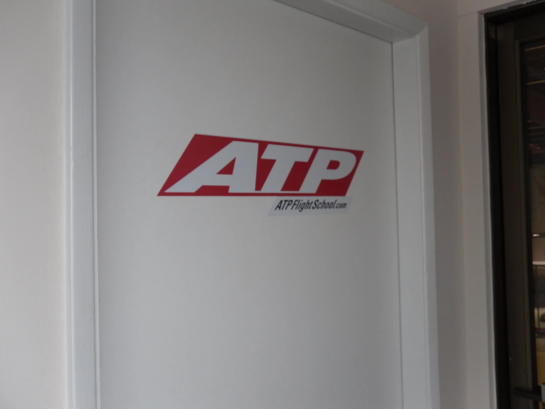
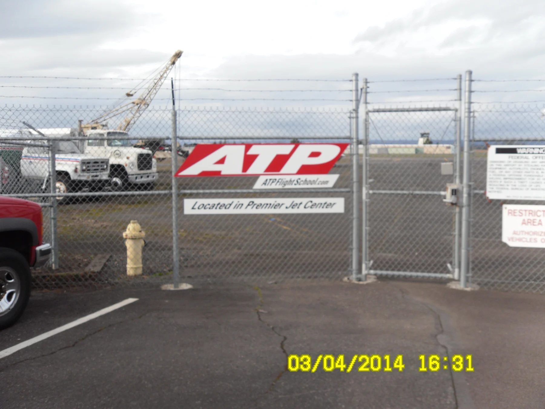
- Training-center signage coordination
- Website and social media management
The context
A national training organization needs to communicate dense program information while helping prospective students find a clear next step, whether they encounter a magazine advertisement, an open-house invitation or a physical location.
Design approach
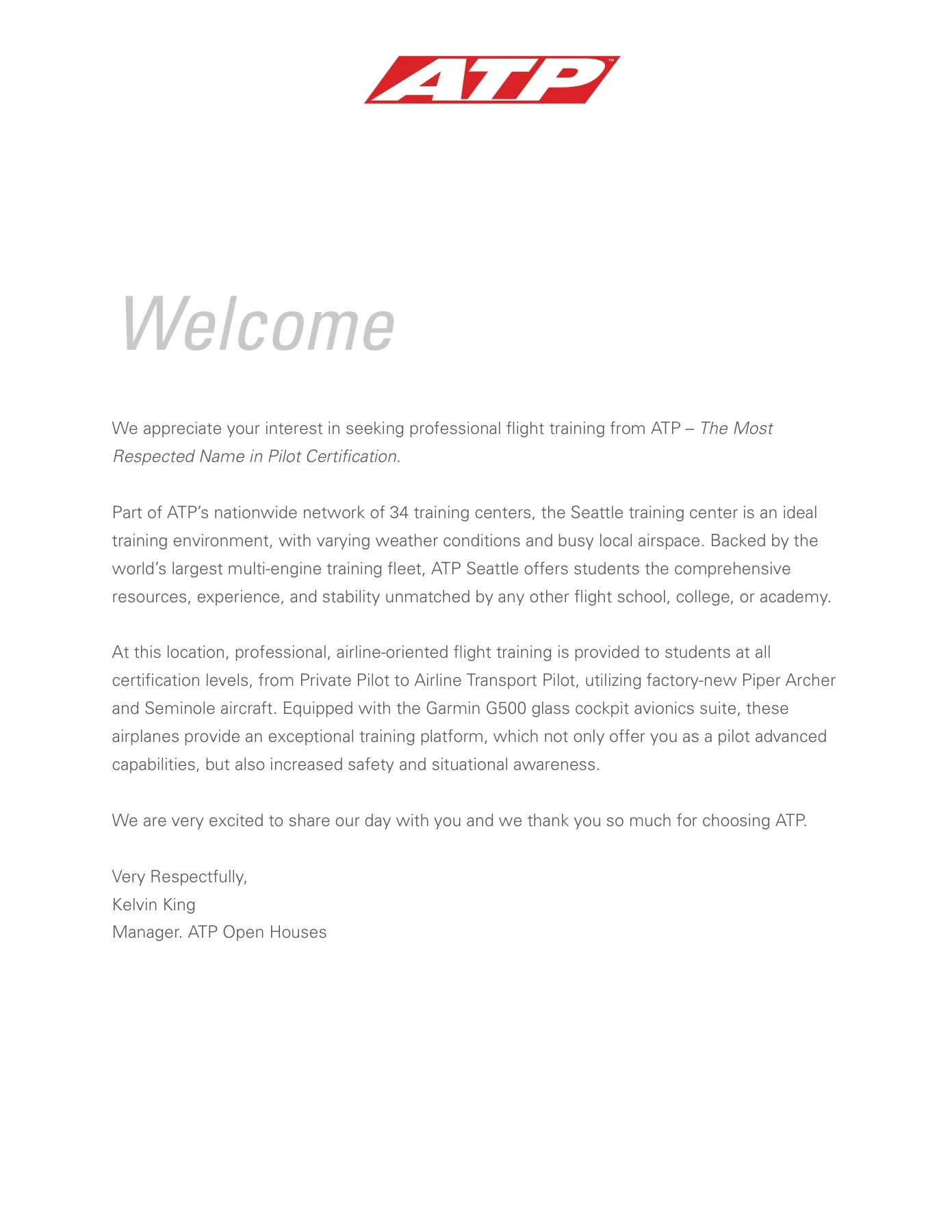
I organized recruitment messages around aviation imagery, clear headlines and structured program details. For open houses, the same restrained system moves into welcome materials and timed schedules. Signage work applies the identity to real entrances and directional decisions, with supplier coordination supporting installation.
01 / Project details
A consistent recruitment system

02 / Project details
From interest to an in-person visit
03 / Project details
A brand in physical space
04 / Project details
Aviation advertising

05 / Project details
A consistent presence on the ground

06 / Project details
Everyday brand applications
More from this collaborationAdditional applications and formats ↓



Project record
Selected work from my design archive. Campaign dates, offers, and contact details pictured in the original materials are historical. Photography and client identities remain credited to their respective creators; my contribution is described above.